Description: this blog post will highlight the crucial role of Call to Actions (CTAs) in web design and development. I will also teach you how to use them effectively.
Introduction
Call to actions (CTAs) are a marketing term that refers to the next step or the action that the marketer wants the consumer to take. Call to actions can be as direct, such as a button that says “Buy Now,” or a softer CTA such as “Read More.” The purpose of a CTA is to guide your visitors down the sales funnel and ultimately convert them into paying customers.

Key Elements of an effective Call to Actions
Word Choice
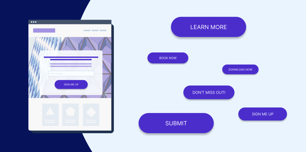
Call to action buttons should feature striking, action-oriented text. Substitute boring words like “submit” and “enter” for more action packed words like “get,” “reserve,” and “try.” Your action words should go along with specific text relating to your offer like: Try Our Free Trial.
Placement
The best practice is to place CTA buttons “above the fold” on landing pages or on the top portion of a web page, which is visible without a user having to scroll. Content that’s above the fold is a lot more likely to get seen. That means, obviously, that content below the fold has a much less chance of being seen. Visitors who don’t even scroll down to see your call to actions aren’t going to be able to click on it to convert.
Visual Appeal
Visually appealing call to actions should stand out from the rest of the page. For example, you should use contrasting colors, bold fonts, white space, unique shapes, shadows, icons, etc. Create a sense of urgency to convince your user to take action. CTAs should be easily identifiable as a button or link that invites users to take desired actions.
How Do I Know My Call to Actions Are Effective?
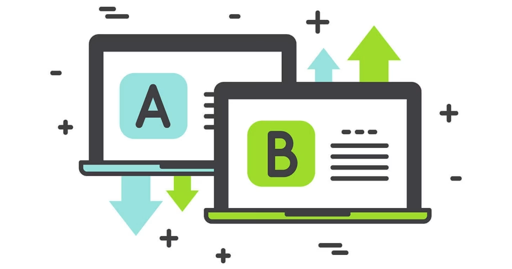
Well, one of the best ways you can test the effectiveness of your CTA is through A/B testing. A/B testing is a methodology for comparing two versions of a web page against each other to determine which one performs better. To check the effectiveness of your call to actions, simply create 2 different versions of your website and use 2 different CTAs on each. Then use tools like Google Analytics to measure which CTA has been clicked the most and has better conversion rates. You will then use the web page with the better performing CTA as your main website.

Types of Call to Actions
1. Lead Generation
These CTAs aim to collect user information, such as email addresses or phone numbers, for lead generation purposes. Examples include “Sign Up for Our Newsletter” or “Download Our Free Ebook.”
2. Sales
These CTAs encourage users to make a purchase or transaction, driving direct sales or conversions. Examples include “Buy Now” or “Add to Cart.”
3. Content Engagement
These CTAs promote further engagement with content, such as reading blog posts, watching videos or exploring additional resources. Examples include “Read More” or “Watch Now.”
4. Social Sharing
These CTAs encourage users to share content on social media, increasing brand awareness and engagement. Examples include “Share This Post” or “Follow Us on Facebook.”
5. Event Registration
These CTAs prompt users to register for events, webinars or workshops. Examples include “Register Now” or “Save Your Spot.”
6. Contact CTAs
These CTAs direct users to contact the company or organization for inquiries or support. Examples include “Contact Us” or “Get in Touch.”
7. Download CTAs
These CTAs encourage users to download resources, such as eBooks, white papers or case studies. Examples include “Download Now” or “Get Your Free Resource.”
Chipotle

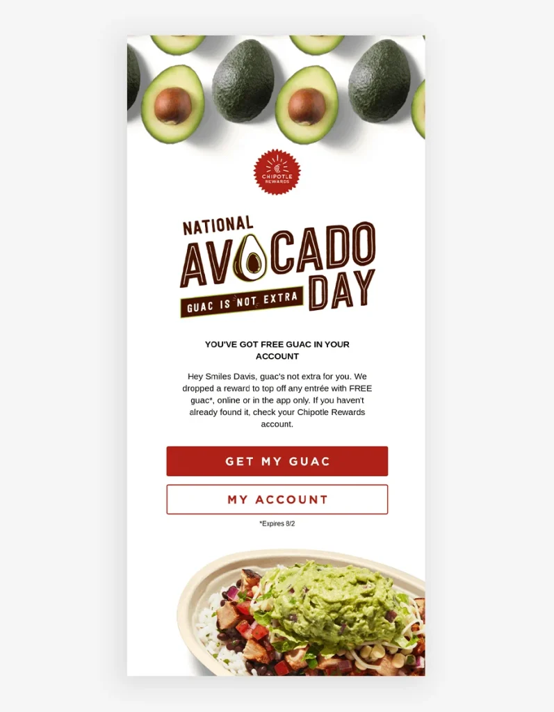
Chipotle puts out an amazing CTA on National Avocado Day. Instead of sounding robotic or mundane, Chipotle makes this special day feel fun with its CTA: “Get my guac.” The shortening of the word guacamole makes the brand’s message easily digestible. By shortening a word or using slang to connect with your audience, you can make your audience take a certain action pretty easily.
Conclusion
So, the most important tips for CTAs are: choosing a good and strong word, make it visually appealing, and place it strategically! A/B testing can be used to test the effectiveness of CTAs and it’s where you put out 2 different sites with 2 different CTAs and see which one performs better. You should also be familiar with the different types of CTAs now, like lead generation and sales. Also, call me biased, but Chipotle has one of the best CTAs ever! The placement is perfect and their word choice/color is also eye-catching that makes me want to click it! You now also know that guac is free on National Avocado Day in Chipotle!
