Description: This blog post will highlight the creative use of the color brown in website design, talk about the psychological and emotional impact of brown tones, and go over 12 real-world examples that effectively utilize brown in website design.
Introduction
Did you know that the psychology of color can strengthen your brand, encourage sales, and guide website visitors? Studies show that people decide if they like a product in 90 seconds, with 90% of that decision based on color. Common website colors include black, blue, red, and gray, while brown is underutilized (only about 2% of logos on websites use brown). Let’s explore why this is and how you can use brown to enhance your website’s visual appeal!
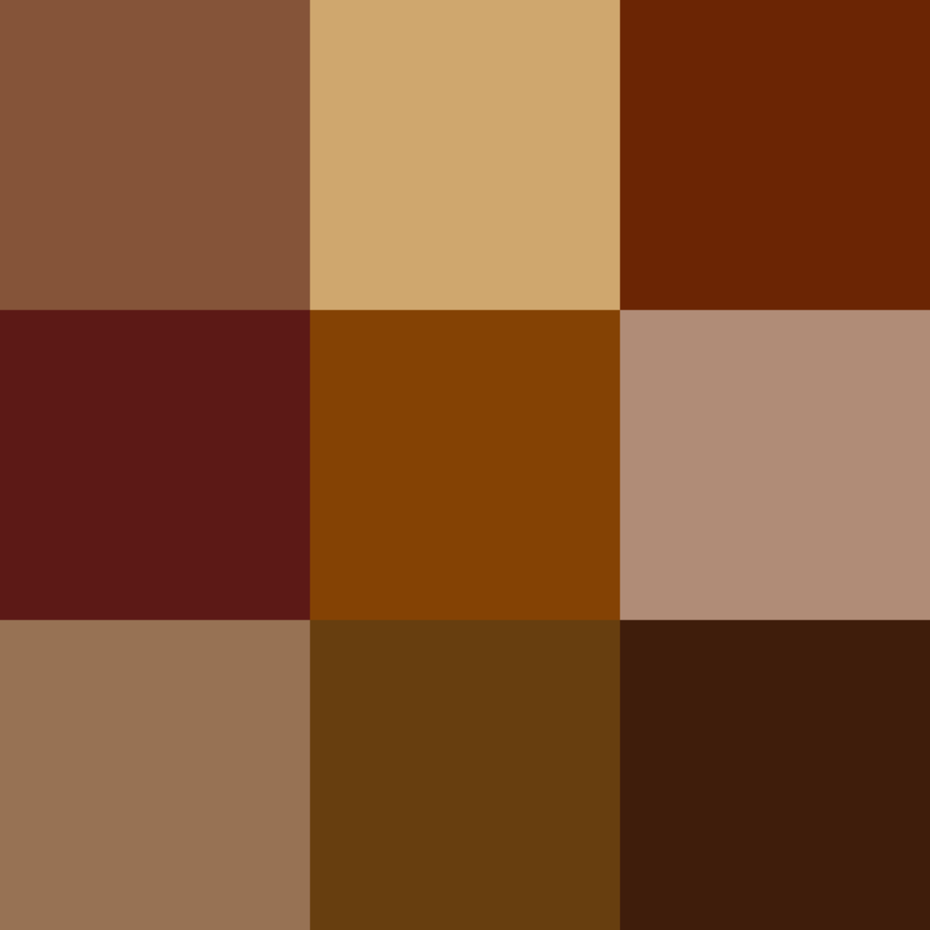
Why We Barely See Brown in Website Design
Brown is the least popular color for web design. Both men and women dislike it, and it can be difficult to pair it well with other colors. Its positive connotations are dependability and ruggedness, but it takes a skilled designer to keep it from looking bland and dark. However, this does not mean that brown is flat out ugly. If used correctly, brown can enhance the visual appeal of your website. You just have to choose the right tones and pair it with a good font. Next, let’s go over some psychological effects of brown in website design and what you can do with brown to convey your message.
Psychology of Brown in Website Design
Some of the key characteristics associated with brown in color psychology include a sense of strength and reliability. Brown is often seen as solid, much like the earth, and it’s a color often associated with resilience, dependability, security, and safety.
- When to use brown in website design
- Brown can be used to stimulate appetite (think of commercials for coffee and chocolate), making it suitable for food-related content. It can also be a good fit for real estate, animals, veterinary, and finance. Brown is also typically better for backgrounds.
- When to avoid brown
- Brown is generally not suitable for grabbing people’s attention and should not be used for call to action items. This color can come off as a bit boring or overly conservative, if used incorrectly.
12 Examples that Effectively use Brown in Website Design
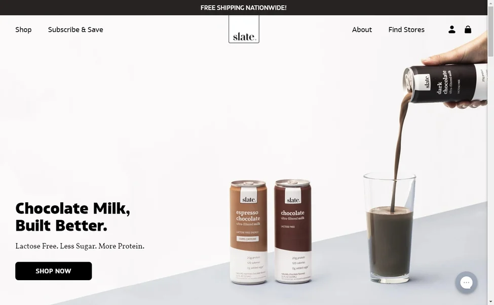
This company sells chocolate milk, lattes, and mix sticks, so brown is the perfect color to use! This website creates a mood of relaxation, earthliness, and endurance.

Brown signifies culture, tradition, and origins. Therefore, using brown in this website design conveys these emotions. Additionally, it embodies sophistication, which any luxury brand aims for.

The underlying color scheme of this website evokes class, coziness, and luxury, all fitting concepts for a five-star hotel.
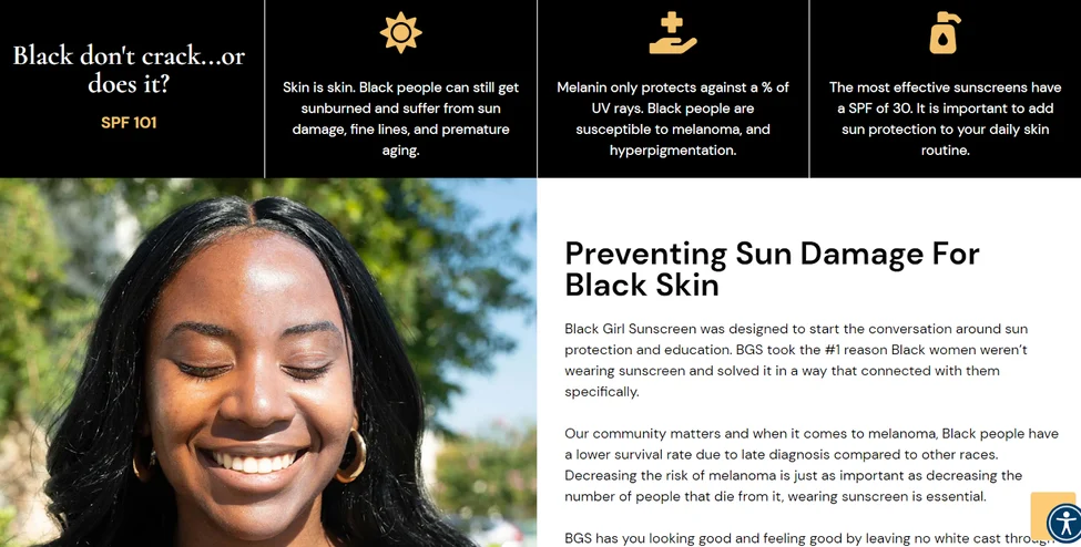
This website’s color scheme includes shades of brown, black, and tan, indicating its focus on reliability and catering to its demographic (dark shade people).
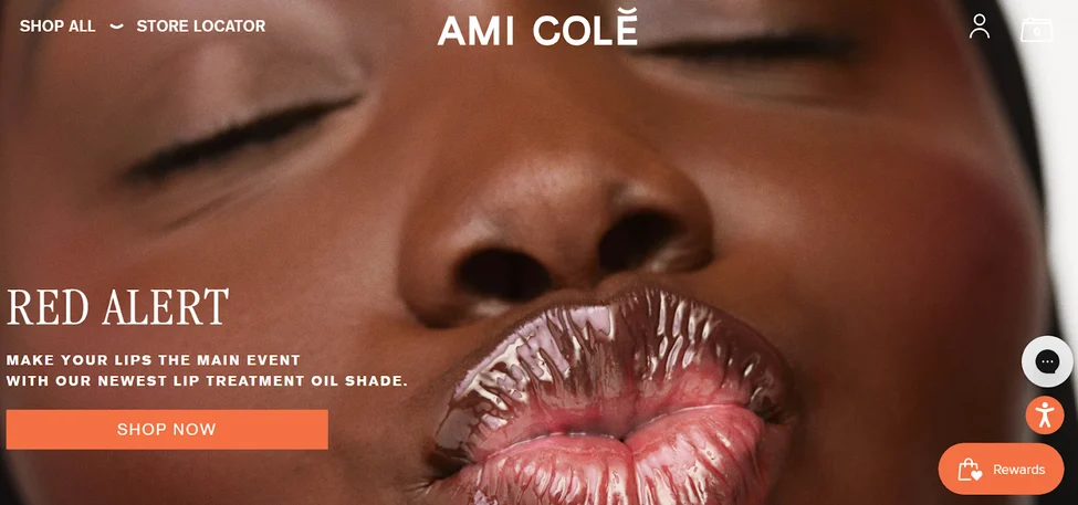
This brown tint to the product photos, icons, and logo gives the company a cool, trendy feel while giving a warm, down-to-earth, and inclusive vibe.
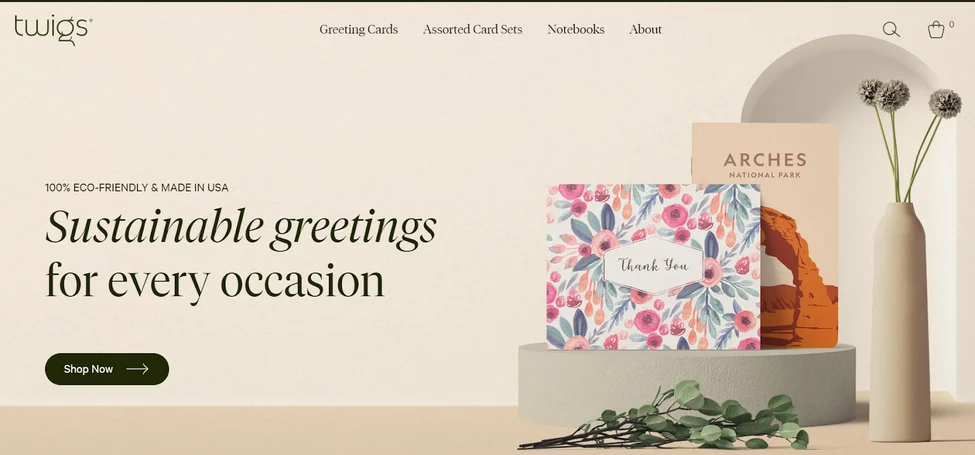
This website’s color scheme includes shades of brown and green, which are the default colors of nature. Therefore, visitors to the website are immediately primed to consider that this paper company keeps the environment in mind.
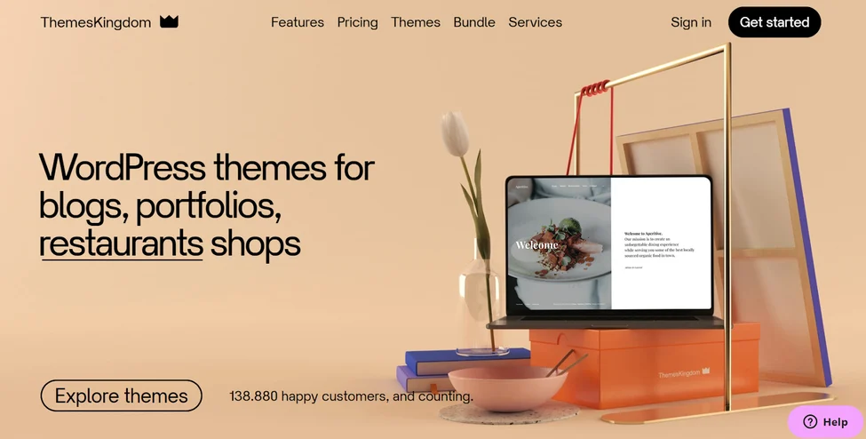
Themes Kingdom’s brown website design subconsciously conveys dependability. It therefore stands out from the competition and creates a warm, memorable presence that nudges visitors to find out more.
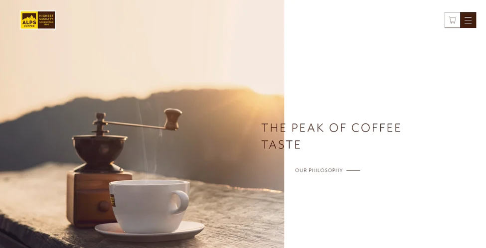
If there’s any company you’d expect to have a brown color scheme for its website, it’d be a coffee company. So it only makes sense for this site to use brown.
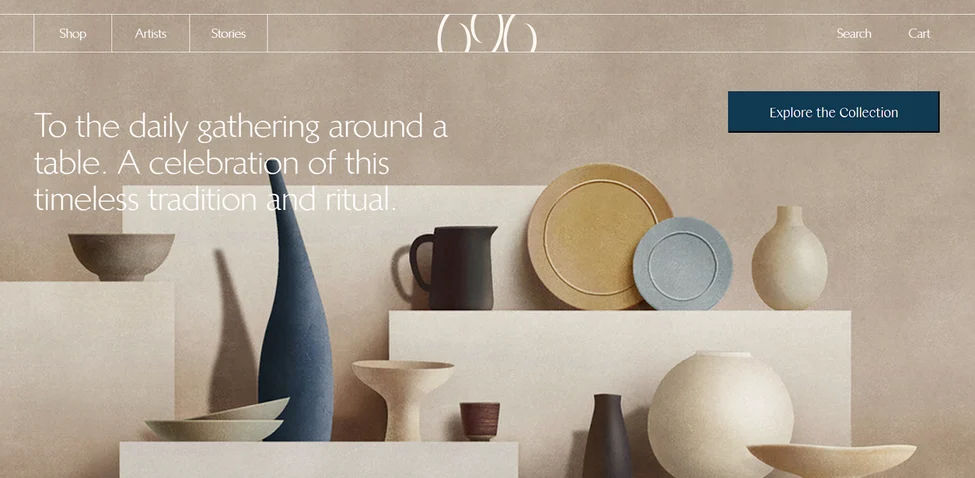
Brown is frequently associated with tradition, which is a significant selling point of the website.

This website manages to strike a balance between being down-to-earth, professional, and creative.
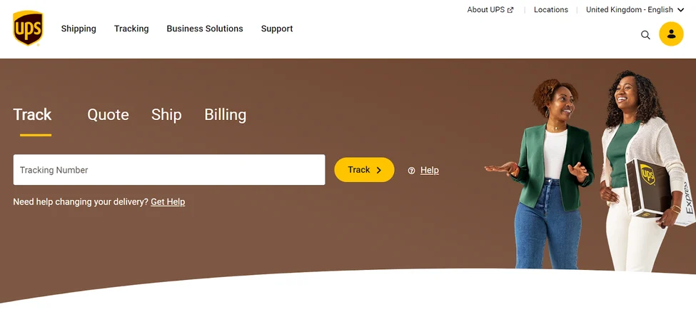
The deep brown coloring stands out against the white background and is a lively way to introduce visitors. The brown palette gives a strong, reliable organizational vibe.
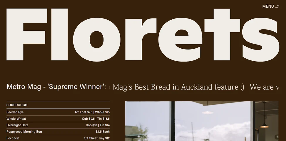
Brown’s the usual color of bread, so it only makes sense that the company’s website matches the color of its product.
Conclusion
So these were some of the great examples of websites using the color brown. From this blog, you learned some of the psychology behind brown, why we barely see brown in website design, and when to use/avoid brown.
